

Strategic Communications
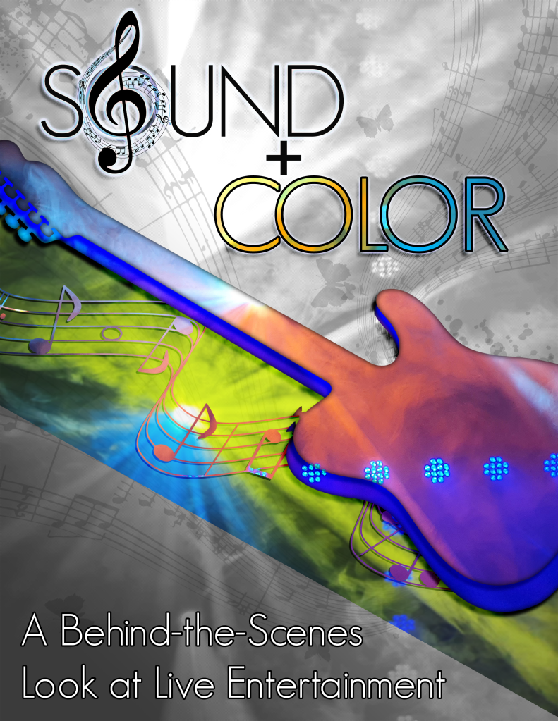
This week, I continued my work on the graphic design project for COM 561. My focus for this class is to offer you a behind the scenes look at live entertainment production, and I wanted a visual product that would relay that goal. I chose to do a flyer-style design, which is typical of rock show posters, and I titled the project “Sound + Color” to express the main focuses that entertainment technicians work on during a show.
To prepare for the assignment, I did a photo shoot in the Gala Showroom in Jackpot, Nevada. Together with the entertainment manager (also a fellow light designer), we turned on a variety of the stage lights and the haze machine to capture footage that would simulate the type of lighting used at a show. The haze looked especially smoky in the photos. I feel that the smoky quality of the photos also translates well towards portraying the ephemeral nature of live light and sound. Luckily, I was able to capture a large amount of photos and videos that I will likely use for multiple projects for COM 561.
One of the challenges I encountered in this project was how to accurately portray the frenetic nature of live show sound and lighting in a static format. I decided to do this with sharp diagonal lines and bold pops of color, plus the addition of an electric guitar silhouette to add visual interest. The focus of color around the guitar is meant to portray both the brightness of live sound and the pops and flashes of a rock n’ roll light show. Additionally, I chose an electric guitar rather than an acoustic guitar to further push the “loud” design that I aimed for. If you look closely, the same photo that makes up the yellow and blue diagonal flash under the guitar is also part of the monochrome background.
For the guitar element itself, I overlaid two copies of the guitar silhouette together and applied different lighting photos using clipping masks. Afterward, I added some inner and drop shadows to give the guitar element a bit more realism. I lined up the two separate photos to match where the blue lights were, to make the transition between the two separate guitar layers look more seamless. I sourced the guitar image from public domain images, and I will list the link at the bottom of the post.
I decided to keep the text simple in the design, only using one font. Even though I did add some drop shadows and outer glows to the text layers, I wanted to let the pops of color in the other part of design shine through and be the focal point. I did add color to the “Color” text via a clipping mask as well, referencing the color version of the background graphic for a bit of contextual design flair. In the revision process, I also placed an open source treble clef graphic on top of the “O” in “Sound” and gave it the same layer style as the text. I felt it gave the text a bit more visual interest and helped express the “Sound” portion more.
After I submitted my initial draft, I went through a peer critique process. I received several helpful suggestions, and I also wanted to make some changes to the flyer after time away from my draft. Thank you to everyone that commented on my project!
I started the revisions process by filling in more of the negative space with music note elements. I had initially thought about doing something similar during the first draft, but was concerned that the design may be too busy. On the second look, I felt that the extra elements would give more texture to the background. To help tone the background note elements down, I reduced their opacity to just 15%. I also applied clipping masks to the notes in the guitar section with a process similar to other parts of the design. Like the guitar silhouette, I sourced the music note images from the public domain and will list all links at the end of this post.
I then made some changes to other design elements. I cleaned up the jagged line at the bottom of the color element under the electric guitar to make the transition between the background and foreground smoother. I also darkened the space at the bottom of the flyer with a diagonally-placed gradient so that the subtitle text would pop more. After that, I changed the subtitle text to white and added a thicker stroke to the outside of the text for more contrast. Overall, I’m very happy with how everything turned out!
All images used in this project were my own, except for the guitar and musical note graphics, found here:
https://publicdomainvectors.org/en/free-clipart/Guitar-vector-silhouette/79842.html
https://publicdomainvectors.org/en/free-clipart/Musical-notes-vector-clip-art/8641.html
https://publicdomainvectors.org/en/free-clipart/Black-and-white-notes/69929.html
https://publicdomainvectors.org/en/free-clipart/Musical-notes-typography-illustration/34712.html
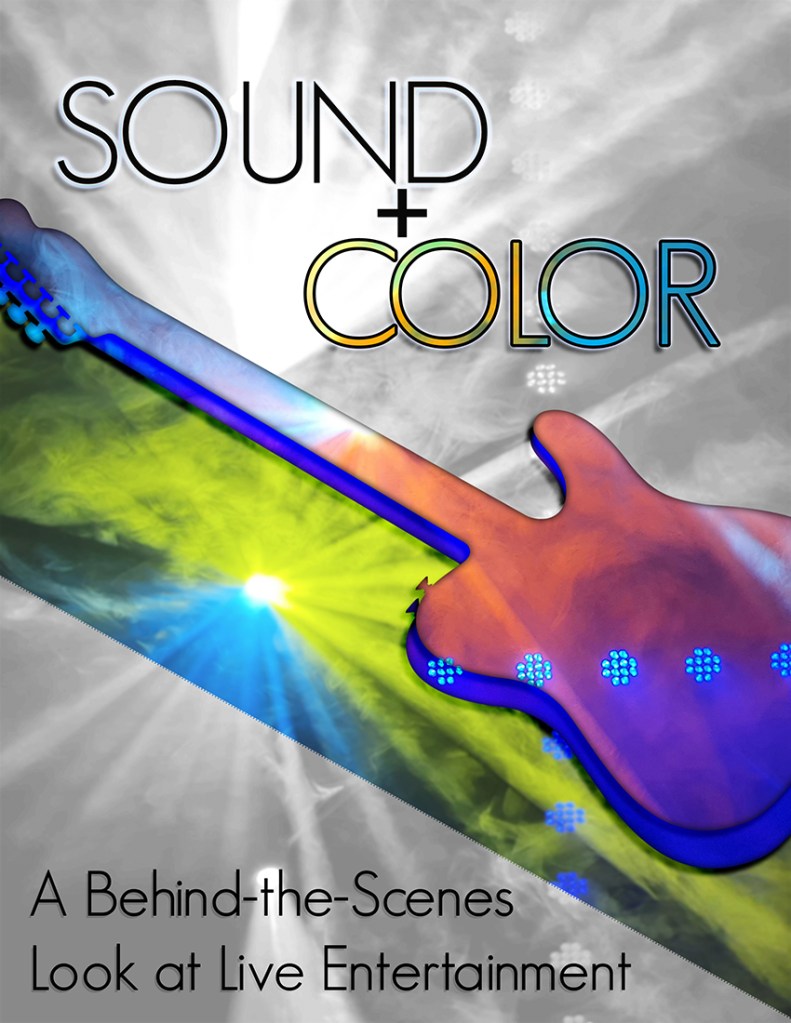
This week, I worked on the graphic design project for COM 561. My focus for this class is to offer you a behind the scenes look at live entertainment production, and I wanted a visual product that would relay that goal. I chose to do a flyer-style design, which is typical of rock show posters, and I titled the project “Sound + Color” to express the main focuses that entertainment technicians work on during a show.
To prepare for the assignment this week, I did a photo shoot in the Gala Showroom in Jackpot, Nevada. Together with the entertainment manager (also a fellow light designer), we turned on a variety of the stage lights and the haze machine to capture footage that would simulate the type of lighting used at a show. The haze looked especially smoky in the photos. I feel that the smoky quality of the photos also translates well towards portraying the ephemeral nature of live light and sound. Luckily, I was able to capture a large amount of photos and videos that I will likely use for multiple projects for COM 561.
One of the challenges I encountered in this project was how to accurately portray the frenetic nature of live show sound and lighting in a static format. I decided to do this with sharp diagonal lines and bold pops of color, plus the addition of an electric guitar silhouette to add visual interest. The focus of color around the guitar is meant to portray both the brightness of live sound and the pops and flashes of a rock n’ roll light show. Additionally, I chose an electric guitar rather than an acoustic guitar to further push the “loud” design that I aimed for. If you look closely, the same photo that makes up the yellow and blue diagonal flash under the guitar is also part of the monochrome background.
For the guitar element itself, I overlaid two copies of the guitar silhouette together and applied different lighting photos using clipping masks. Afterward, I added some inner and drop shadows to give the guitar element a bit more realism. I lined up the two separate photos to match where the blue lights were, to make the transition between the two separate guitar layers look more seamless. I sourced the guitar image from public domain images, and I will list the link at the bottom of the post.
I decided to keep the text simple in the design, only using one font. Even though I did add some drop shadows and outer glows to the text layers, I wanted to let the pops of color in the other part of design shine through and be the focal point. I did add color to the “Color” text via a clipping mask as well, referencing the color version of the background graphic for a bit of contextual design flair.
Overall, I’m happy with how the project turned out. I may want to add or revise elements after the draft review. I look forward to hearing your suggestions and comments!
All images used in this project were my own, except for the guitar graphic, found here:
https://publicdomainvectors.org/en/free-clipart/Guitar-vector-silhouette/79842.html
Here are my completed tutorials!


Welcome to my WSU Portfolio blog!
Hello Everyone! In starting my coursework for COM 561, I’ve been challenged to come up with a focused topic for the duration of this semester’s assignments. After much thought and deliberation, I’ve decided to use my extensive background in live entertainment production to my advantage.
In my production experience, referred to in the field as tech work, my primary focus for the past 7+ years is related to lighting design and programming for national rock, country, and pop acts. I also specialize in video engineering and sound engineering to a lesser extent.
I want to give you all a behind the scenes look into what goes into a show and highlight the work that entertainment technicians do as the unsung heroes of entertainment production. I challenge you to expand your definition of stagehands (or “roadies”) and learn about the hidden culture and craft that is behind every concert you see. From sound to lighting, get an insider’s view of the processes that bring music alive.
To that end, I’ve partnered with the entertainment manager and tech crew at the Gala Showroom in Jackpot, Nevada to show you the production process. Known as one of the last entertainment showrooms in Northern Nevada, the historic Gala Showroom hosts approximately 250 seats for an intimate concert experience. From world famous and bombastically loud rock acts like Dokken, up and coming country acts like Sam Riggs, and the occasional comedy night or stage magician, the seasoned techs working at the Gala have seen it all.
And in the interest of full disclosure, one of those techs is me! Even though my day job is in marketing, the Gala still holds a place in my heart and I work there as much as I can. While I can’t promise any concert footage due to copyright concerns, I’m looking forward to providing you with interviews from other techs in the field and a look at the work we do to put on every show. I promise you will never look at live sound and lighting the same way again!
