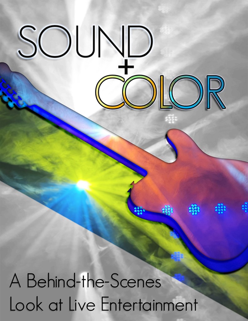
This week, I worked on the graphic design project for COM 561. My focus for this class is to offer you a behind the scenes look at live entertainment production, and I wanted a visual product that would relay that goal. I chose to do a flyer-style design, which is typical of rock show posters, and I titled the project “Sound + Color” to express the main focuses that entertainment technicians work on during a show.
To prepare for the assignment this week, I did a photo shoot in the Gala Showroom in Jackpot, Nevada. Together with the entertainment manager (also a fellow light designer), we turned on a variety of the stage lights and the haze machine to capture footage that would simulate the type of lighting used at a show. The haze looked especially smoky in the photos. I feel that the smoky quality of the photos also translates well towards portraying the ephemeral nature of live light and sound. Luckily, I was able to capture a large amount of photos and videos that I will likely use for multiple projects for COM 561.
One of the challenges I encountered in this project was how to accurately portray the frenetic nature of live show sound and lighting in a static format. I decided to do this with sharp diagonal lines and bold pops of color, plus the addition of an electric guitar silhouette to add visual interest. The focus of color around the guitar is meant to portray both the brightness of live sound and the pops and flashes of a rock n’ roll light show. Additionally, I chose an electric guitar rather than an acoustic guitar to further push the “loud” design that I aimed for. If you look closely, the same photo that makes up the yellow and blue diagonal flash under the guitar is also part of the monochrome background.
For the guitar element itself, I overlaid two copies of the guitar silhouette together and applied different lighting photos using clipping masks. Afterward, I added some inner and drop shadows to give the guitar element a bit more realism. I lined up the two separate photos to match where the blue lights were, to make the transition between the two separate guitar layers look more seamless. I sourced the guitar image from public domain images, and I will list the link at the bottom of the post.
I decided to keep the text simple in the design, only using one font. Even though I did add some drop shadows and outer glows to the text layers, I wanted to let the pops of color in the other part of design shine through and be the focal point. I did add color to the “Color” text via a clipping mask as well, referencing the color version of the background graphic for a bit of contextual design flair.
Overall, I’m happy with how the project turned out. I may want to add or revise elements after the draft review. I look forward to hearing your suggestions and comments!
All images used in this project were my own, except for the guitar graphic, found here:
https://publicdomainvectors.org/en/free-clipart/Guitar-vector-silhouette/79842.html

Hi Amy! I am so impressed with the design you created. It is clear that you invested a lot of time and thought into what you created. I love the story behind your design, and I think it is portrayed very clearly. I also love that the images you used were staged and shot by you! I think the composition is executed well, and the placement of everything is great. You clearly used elements of Gestalt Theory in your design. I love how the words sound and color visually represent what those words mean. I only have some minor suggestions. The border between the bottom black and white block and the middle color block seems to be textured and is a little distracting. I think if you were to make that a smooth border that would be an improvement. I also think you could benefit from experimenting with a different font for the bottom text. Possibly something softer. That being said, there is not a lot I would change about this design. Awesome job!
LikeLike
Hi Amy!
Wow. Your design is incredible and I’m even more impressed that you took the photos yourself, including the smokey background. I think you did a great job making the design 3D so it did not look “static” like you said. It definitely portrays your vision and blog content. I saw that you wrote that you wanted to keep the text simple by using one font. My only suggestion might be to use a different font. I think I’m only suggesting that because I think the “O” in “sound” looks unreasonably large compared to the “U”. This is just nit-picking because I think your project looks fantastic. My only other suggestion is that I feel the lights over the guitar might not be needed. I think the ones behind the guitar look great but maybe taking away the horizontal line would help shift my gaze to the guitar and be less distracting. Overall, I think the strongest part of this design is how many senses you are conveying through a static photo. It’s almost as if it moves when looking at it. I think your design looks fantastic! I can tell you are very creative and it shows. Great job.
– Natalie Steele
LikeLike
Amy – I think you did a great job with this project. The various lights shining through the hazy background and the colors is really cool. I feel like the more I looked at this, the more lights I noticed. Also, it’s so impressive that you were able to create a show-like experience to take these pictures. It really does evoke the feeling of being at a big live concert. I also like the use of colors within the electric guitar relief. It’s effective at expressing the importance of color in live production, and the ways that it can enhance the experience for an audience. I think the one suggestion I could make is to play around with the stroke surrounding the word “sound” the white is kind of lost on parts of the word because of the lightest segments of the background. Your job seems really interesting, and I can’t wait to learn more about it through your projects in this class.
LikeLike
Thank you to everyone that commented on my draft. All of you had excellent feedback and kind comments that helped me look at the draft with fresh eyes.
In taking a few days away from the design and looking at it now, I think that overall it is a strong design and I want to keep the general look. However, I want to smooth out the bottom edge of the color piece for sure. I’m not sure why it ended up looking a bit pixelated, because the other side that was cut in the same way did not. That side is currently hidden by the guitar layers, but in my PSD file that edge can still be made visible and it looks normal.
Either way, I would also like to adjust some of the font styles. I’m not sure yet exactly what I want to do, but I will sit down with Photoshop this week and experiment with some things. If I have the time and the resources, I may add more detail in the design through more design layers, possibly with musical notes or additions to the guitar layers.
LikeLike